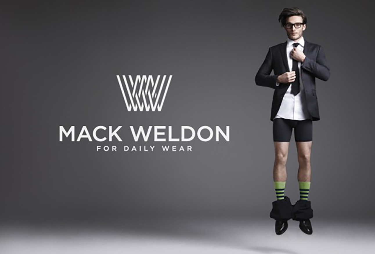
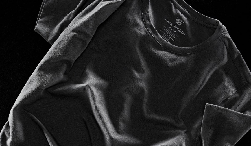
Monogram-based logo and initial hero image
Some sketch excerpts of the thinking on the logo. The “eureka” sketch focuses on the manufactured form of fabric resulting in the “woven” pattern of the monogram.
Initial press adverts with the photography and bold typography, Hurme Geometric, combining to create a strong simple visual impact.
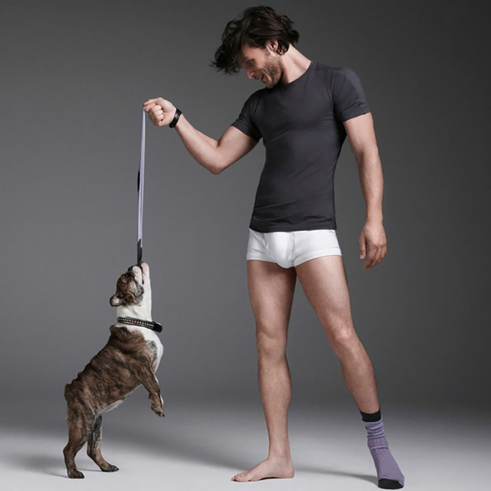
Art direction responsibilities within the playful but simple photographic style of photographer Cris Craymer for the products, which also included motion for product video.
Digital display adverts
Marketing logo “lockup” and business cards
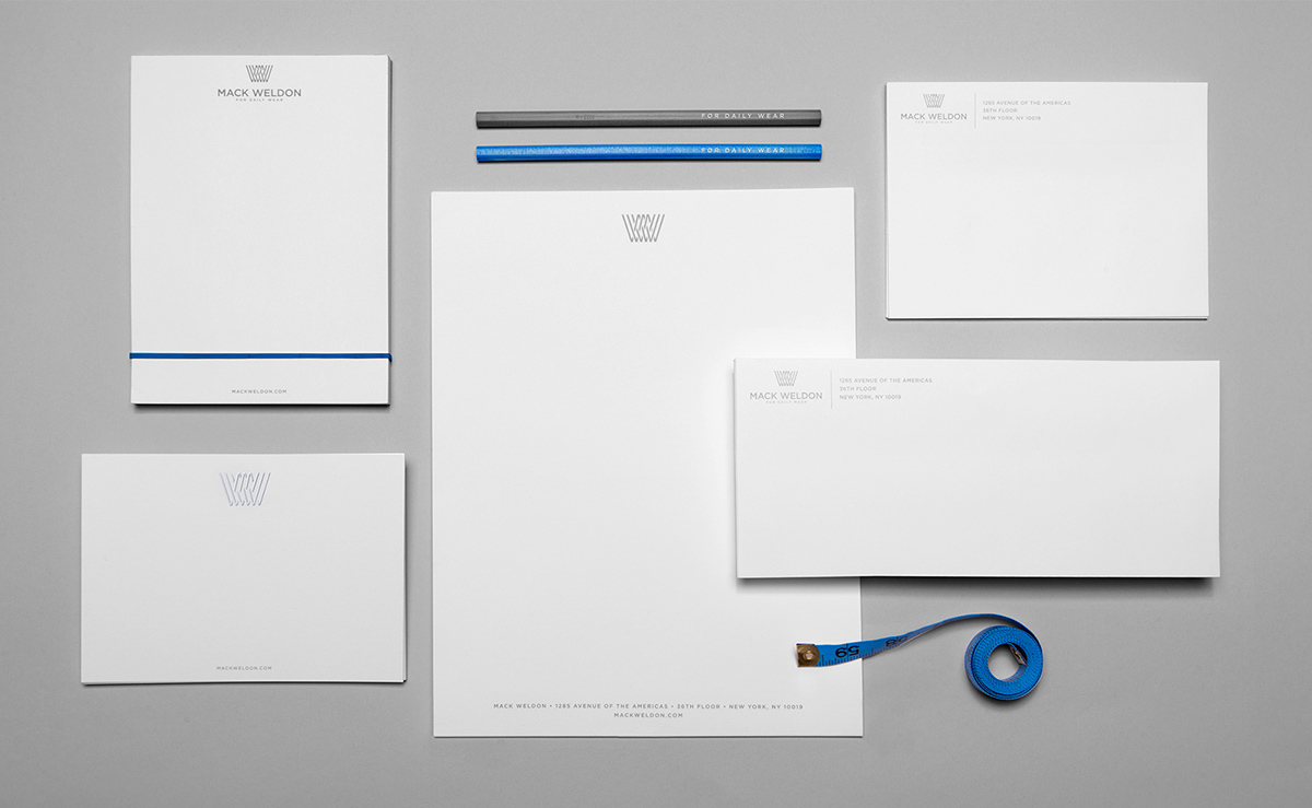
Corporate stationery
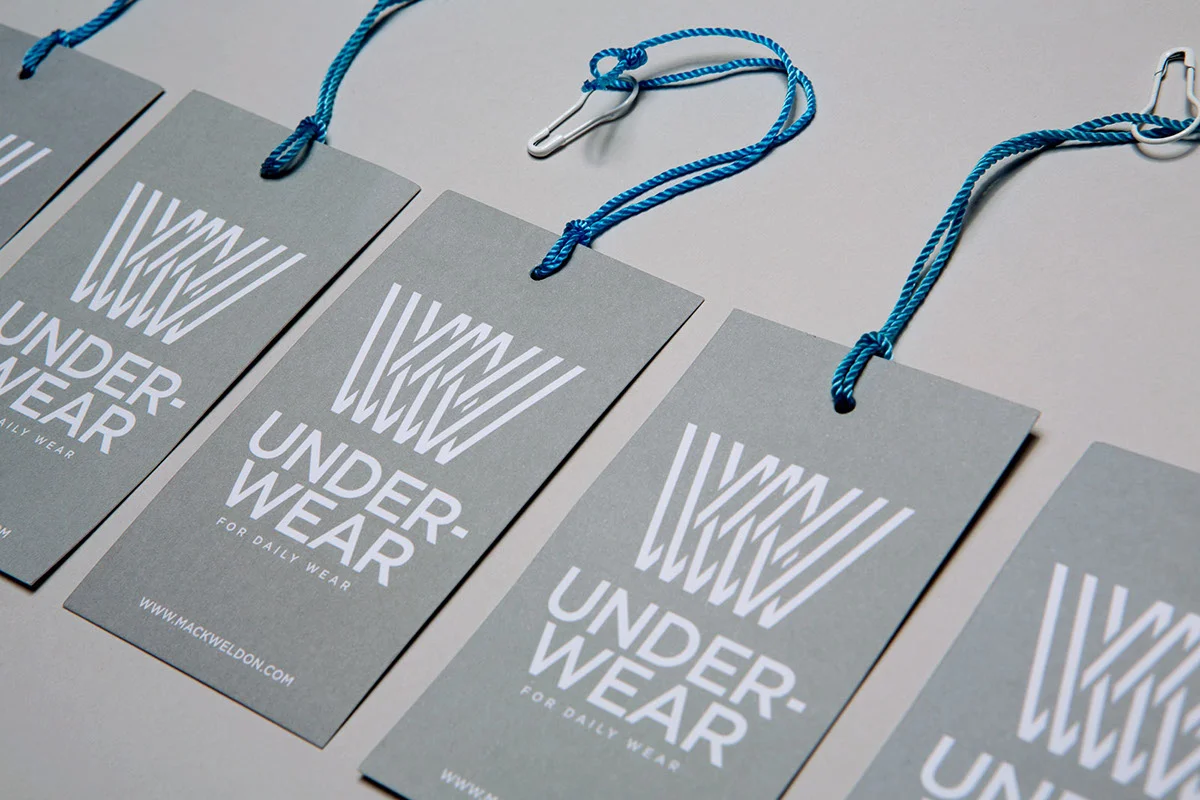
Here the bold sans-serif typeface lends instant product recognition on hangtags
The bold typography is inserted into everything, including informational compositions within the “tag-less” product and woven tag line into the fabric.
Everything was thought of including exterior shipping envelopes within the initial design consult.
Straightforward, no-nonsense infographics which highlight both the innovative materials and groundbreaking construction of the initial products.
Design consultation for Silver, Mack Weldon’s first brand extension, touting silver “filament” as a fabric innovation for extra wicking and odor control.

